Alkeme Branding
—
Alkeme is a dedicated gluten-free, plant based food manufacturer in Rossland, BC that specializes in handmade breads and bars.
One by One was hired in 2018 to provide a full rebrand. Because Alkeme is a multi-faceted brand with a variety of products and community initiatives aimed at a range of consumers, the branding needed to be flexible.
Logo
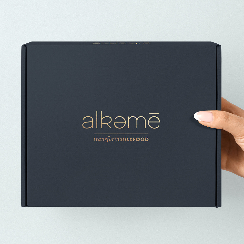
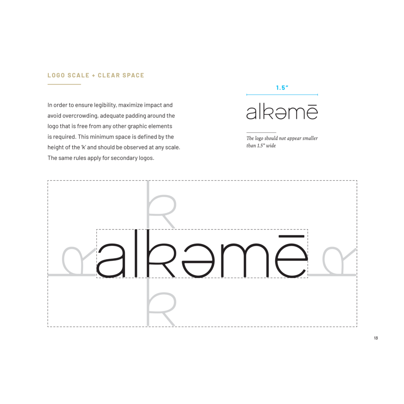
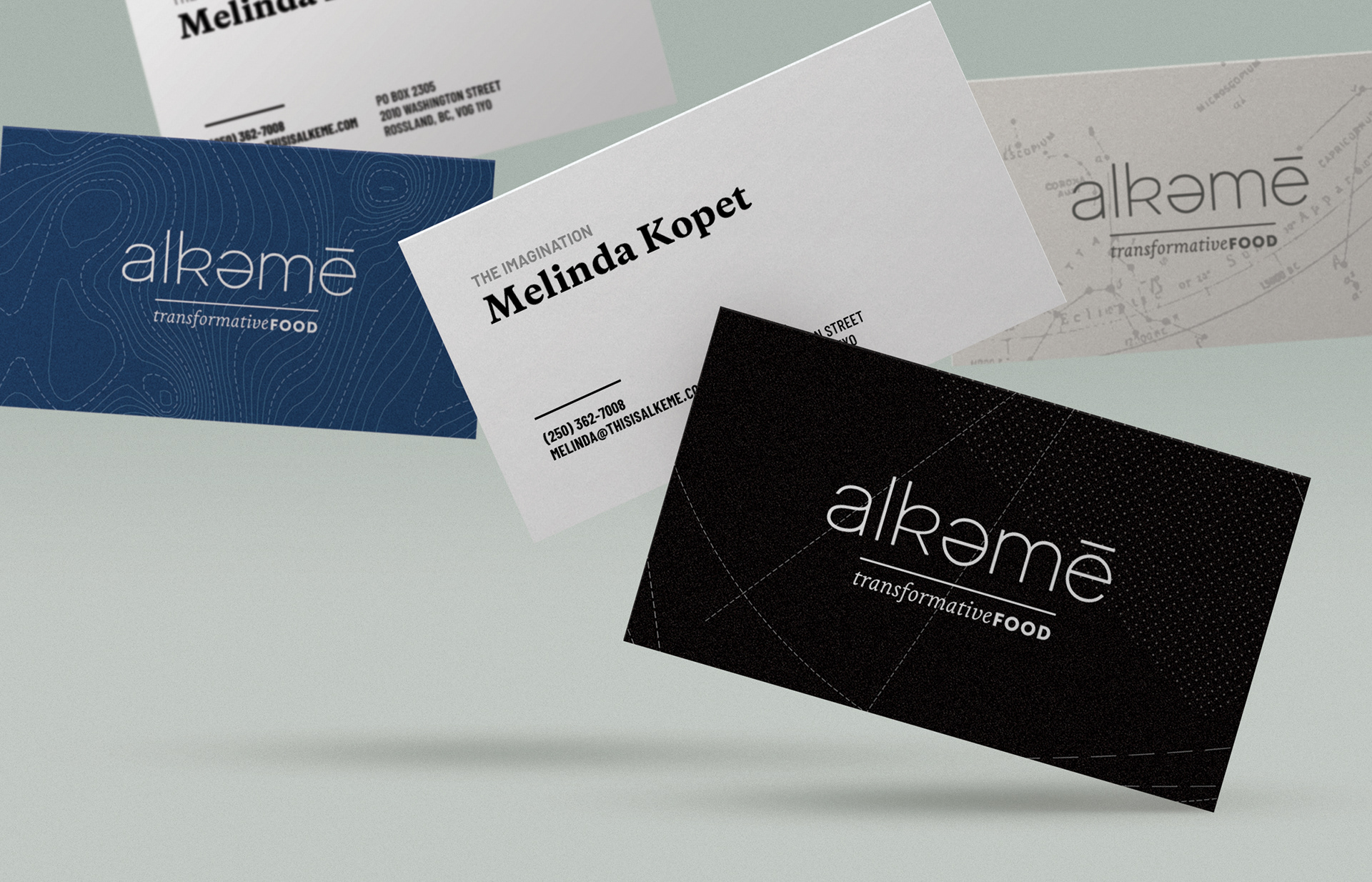
The Alkeme logo is clean and simple. Light in weight, but rigid and balanced, the phonetic elements (reversed ‘e’and accent) portray a sense of origin and invention that echo the brand’s values of renewal and rejuvenation.
Typography
As a company dedicated to health and wellness, the typefaces chosen to represent Alkeme should be trustworthy and strong. Copernicus conveys friendliness without being overly whimsical, Barlow is direct and straightforward while Livory—used for more personal communications—is more intimate and comfortable.
Patterns
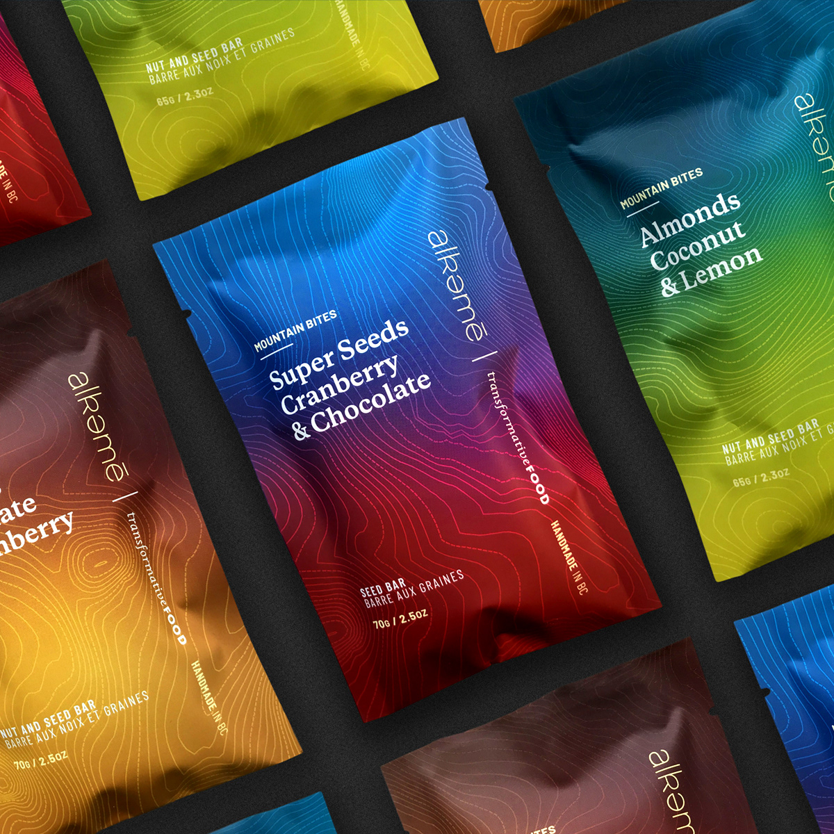
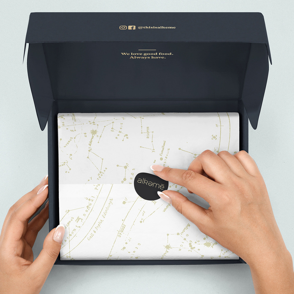
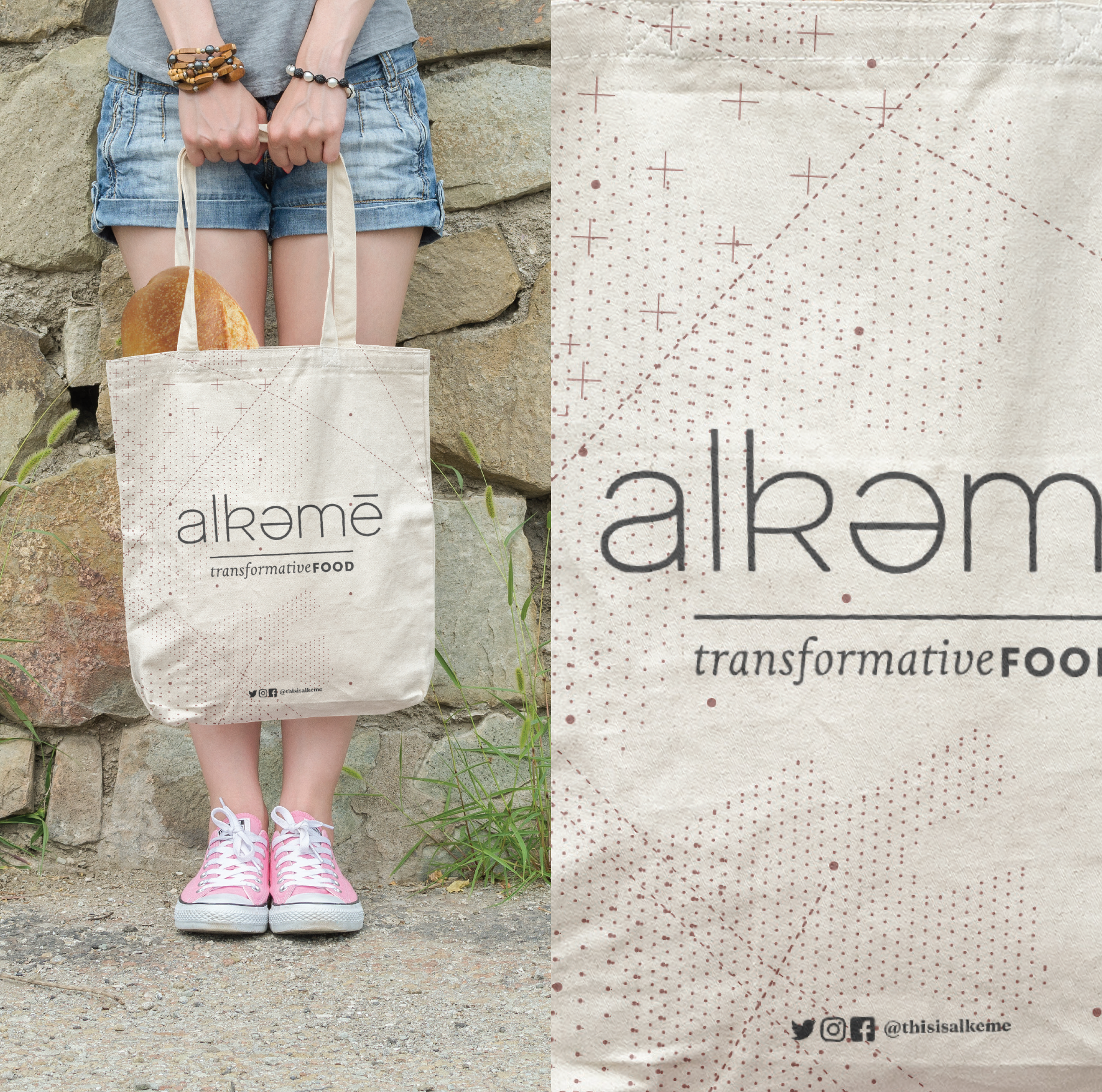
Patterns are a component of the alkeme brand. Inspired by maps and cartographic symbology, these patterns convey a sense of wonder, exploration and discovery—values Alkeme holds dearly.
Colour
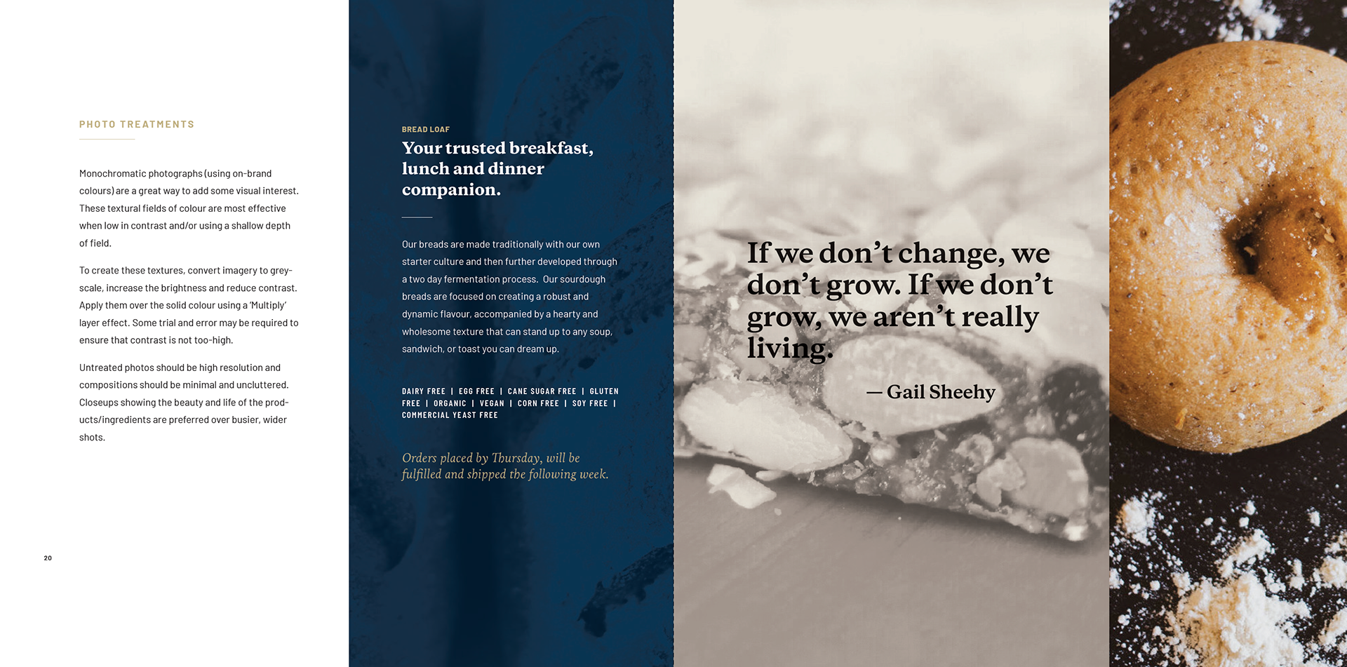
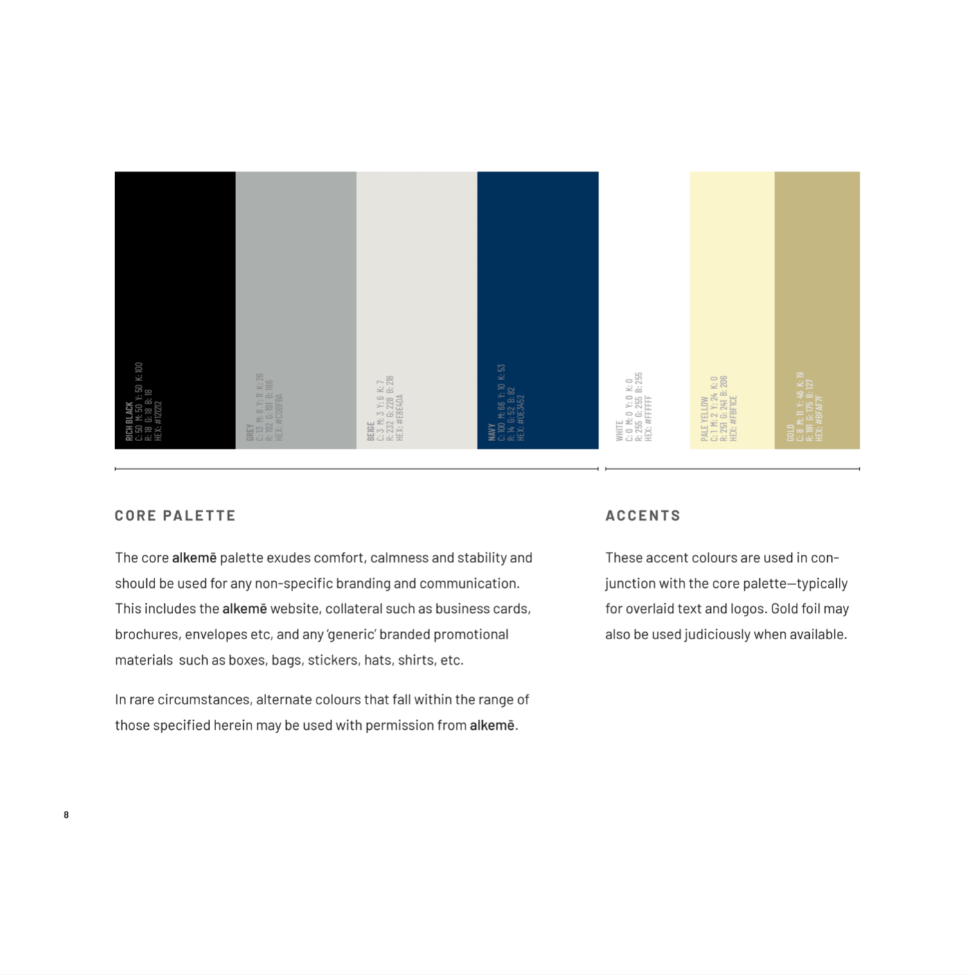
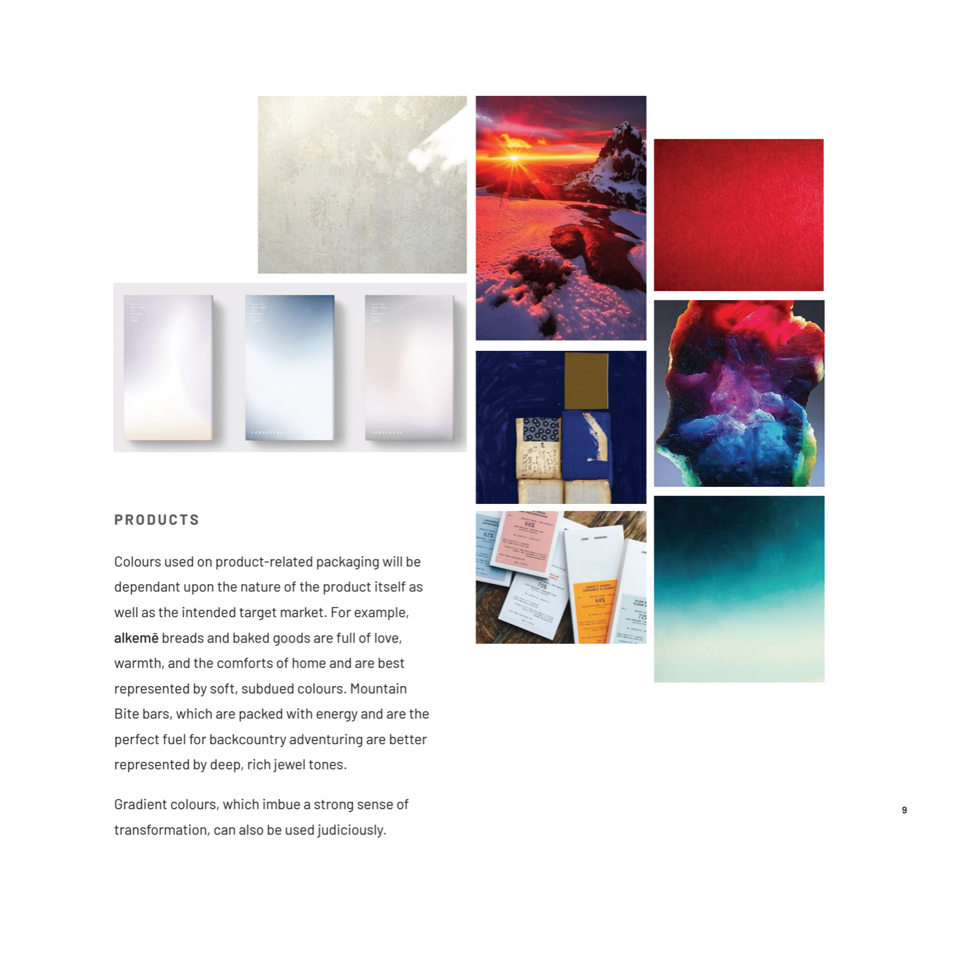
The core palette and accents (used for non-specific branding and communications) exudes comfort, calmness and stability. Colours used for product packaging varies upon the nature of the product, as well as the intended target market. For example, Alkeme breads and baked goods are full of love, warmth, and the comforts of home and are represented by soft, subdued colours. Mountain Bites, which are packed with energy and are the perfect fuel for backcountry adventuring are represented by deep, rich jewel tones.
Brand guidelines excerpt
Brand guidelines excerpt